Off Nominal · Pair-coded with Claude

222 declassified UAP files, made browsable in a weekend

In May 2026 the US Department of War released the first two batches of unsealed UAP files under PURSUE. The official site is a paginated table. I wanted to see what 80 years of incidents look like across time and space — so I built one. Off Nominal is NASA's term for anything that doesn't behave as expected; the name fit.

Open the live app
222

Declassified files

7

Source agencies

1945 — 2026

Incident date range

0

Source PDFs hosted

Why I started

The Department of War's PURSUE initiative (Presidential Unsealing and Reporting System for UAP Encounters) is a rolling declassification project. The first two drops — May 8 and May 22, 2026 — put 222 records online, contributed by DoW, the FBI, NASA, ODNI, DOE, the State Department, and the CIA.

The official UX at war.gov/ufo is a paginated table behind heavy bot protection. Useful if you know the exact file you want; almost useless if you're asking "where and when did this stuff actually happen?"

That's the question I wanted to answer. A timeline of UAP incidents across 80 years, a globe of where they happened, a side panel for the case detail, and one set of filters that drives all three. Build it, browse it, link every dot back to the official .gov source. Host nothing of theirs.
12 seconds of the actual app. Brush a date range on the timeline. The map filters to the same period — the modern UAP wave is concentrated in CENTCOM and the Western US. Click a marker, pick a case, the detail panel slides in.

The build, briefly

Pair-coded with Claude across an evening and a morning. Vite, React, TypeScript, MUI. d3-scale for the timeline, d3-geo + TopoJSON for the map (no tile servers, no API keys — same "no external hosting" ethos as the rest). Playwright once, just to fetch the data.

The single biggest surprise: the entire dataset is a 297 KB CSV at war.gov/Portals/1/Interactive/2026/UFO/uap-data.csv. The "interactive table" on the official site is jQuery DataTables reading that file. No PDF parsing, no per-case scraping. One curl-equivalent and the whole corpus is on disk as structured rows.

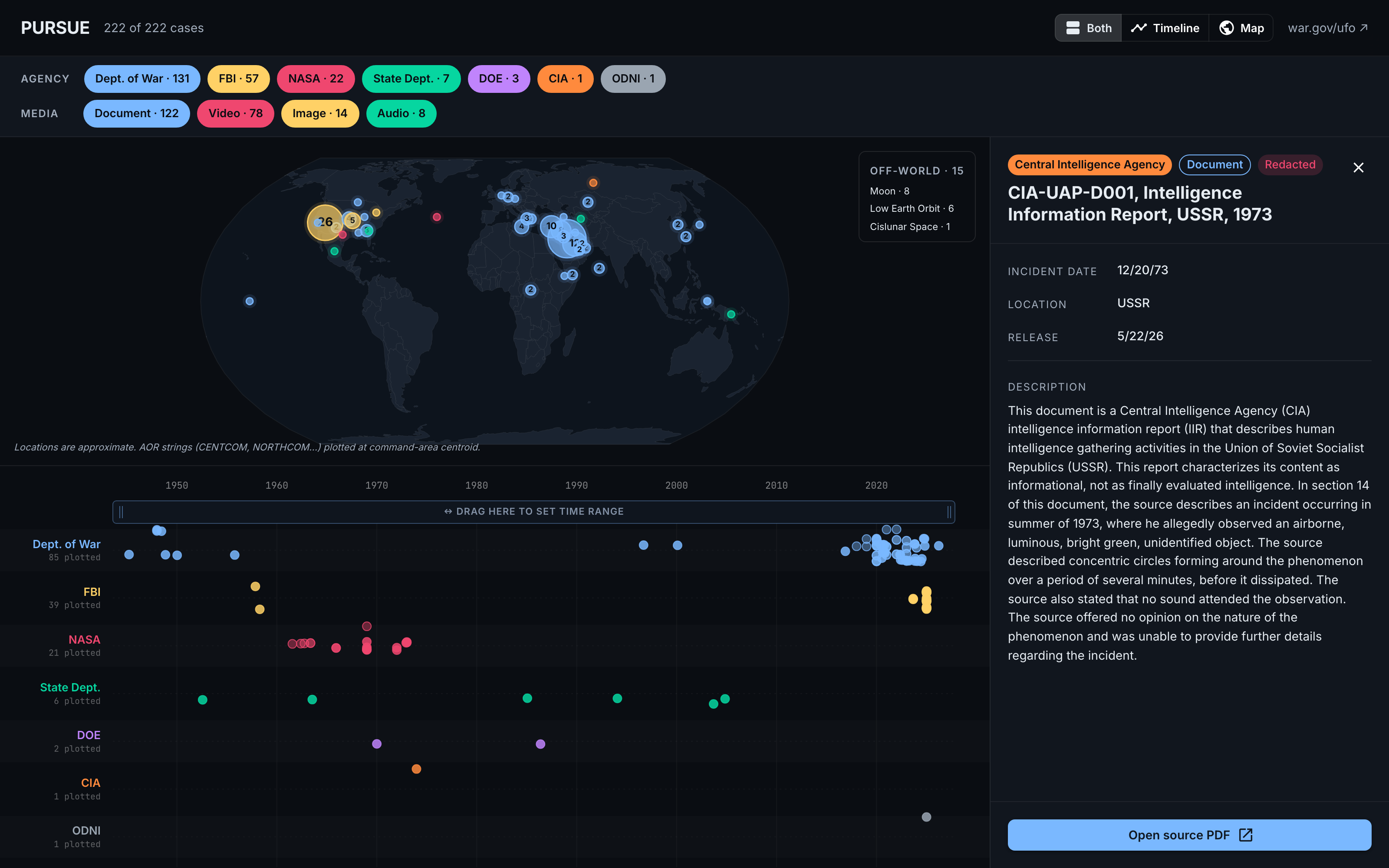
The same three-panel view with the side detail panel opened. The right side now shows the full case record: Central Intelligence Agency badge, Document and Redacted chips, the title CIA-UAP-D001 Intelligence Information Report USSR 1973, metadata rows for incident date 12/20/73, location USSR, release 5/22/26, and a multi-paragraph description of a 1973 sighting of an airborne luminous bright green unidentified object. A blue Open source PDF button anchors the bottom.

Click any dot. The detail panel slides in, the map and timeline stay live. The Open source PDF button takes you to the official media.defense.gov file.

What I learned

The legal/ethical posture matters more than the engineering.

Federal works are public domain by statute (17 USC §105). PURSUE was released for the public; civic reuse is the explicit intent. But war.gov is Akamai-protected and blocks even /robots.txt from a plain curl. Getting through requires Playwright with a real-Chrome channel and a couple of stealth flags — which crosses from "polite scraper" into "actively evading their bot detection."

Talked it through with the user, made the call: pull the one index CSV once, never re-host any source material, link every case back to war.gov or media.defense.gov by URL. The repo is about 5 KB of JSON and code. Anything you want to read, you read on the government's servers.

One filter set, three views.

The split layout — map up top, timeline bottom, detail panel right — works because the filters lift up. Agency chips, media-type chips, and the brush-to-zoom date range all live on the root component; both visualizations subscribe.

The visible payoff: brush the timeline to Dec 1989 – Aug 2023, and the map's case count drops from 222 to 68, the off-world badge disappears (no Apollo-era moon cases in that range), the FBI lane goes empty (their bulk releases are 1950s), and the Middle-East CENTCOM cluster lights up. The modern "Navy Tic-Tac era" is visually obvious without having read a single PDF.

The detail panel showing the CIA 1973 USSR Intelligence Information Report, with the description text describing an observed airborne luminous bright green unidentified object.

The Source URLs go to media.defense.gov and dvidshub.net — the original government-hosted artifacts.

The brush hit-target was the only real UX problem.

The first version made the entire chart area brush-receptive. Felt glitchy: hover a dot, accidentally start a drag, lose your place. The fix was a visible zoom band above the lanes — tinted, with grip handles on each side and an "↔ DRAG HERE TO SET TIME RANGE" label that adapts to width. The brush only fires from the band. Dot clicks always do what you expect.

"A weekend of pair-coding turned a paginated government table into something you can actually browse."

What's in there

Swimlane timeline by agency

One lane per source agency, colored. Each case is a dot at its incident date. Hover for date + title; click for the detail panel. The brush band drives the zoom. Out-of-range dots clip cleanly; tick density adapts to the visible span. Lane labels show how many dots are plotted vs. how many cases that agency has total (about a third of the corpus is undated — file-numbered FBI bulk releases).

World map of incidents

Equal Earth projection. d3-geo, world-atlas TopoJSON, ~107 KB. Each unique location string in the dataset (48 of them, hand-mapped to lat/lng once) becomes a marker — sized by case count, colored by the dominant agency at that point. Combatant Commands (CENTCOM, NORTHCOM, AFRICOM, EUCOM, INDOPACOM) plot at their area-of-responsibility centroid; that's where the modern CENTCOM cluster comes from. Off-world cases (Moon, Low Earth Orbit, Cislunar Space) are surfaced in a corner badge instead.

Coordinated filters

Agency chips, media-type chips (Document, Video, Image, Audio), and a brush-to-zoom date range. Every filter drives both the timeline and the map. When the date brush is active, a dismissable chip shows up in the toolbar — visible from any view mode, including map-only, so you can clear it without going back to the timeline.

Side detail panel

Not a modal drawer. A flex sibling: the chart shrinks, the panel slides in. Full case description, all metadata, an "Open source PDF" button to the official file, a "View on DVIDS" button when there's a video. Close it and both visualizations reclaim the space.

A browseable view of a public archive

PURSUE is going to keep releasing files. The official UX won't change much; it doesn't need to — a paginated table is fine for direct retrieval. But for everyone trying to read the shape of the disclosure, having a map and a timeline of the same data feels like the difference between a list of receipts and a dashboard.

The project hosts nothing of theirs. Every dot is a link out. The whole thing is one CSV away from being current. If the DoW publishes Release 03, it's one npm run fetch-csv away.

Try it yourself

The live app runs right here on barnesy.me — no install, nothing to download. Drag the zoom band, click markers, pick cases. The original DoW release page is one click further if you want to read the source files in their official home.